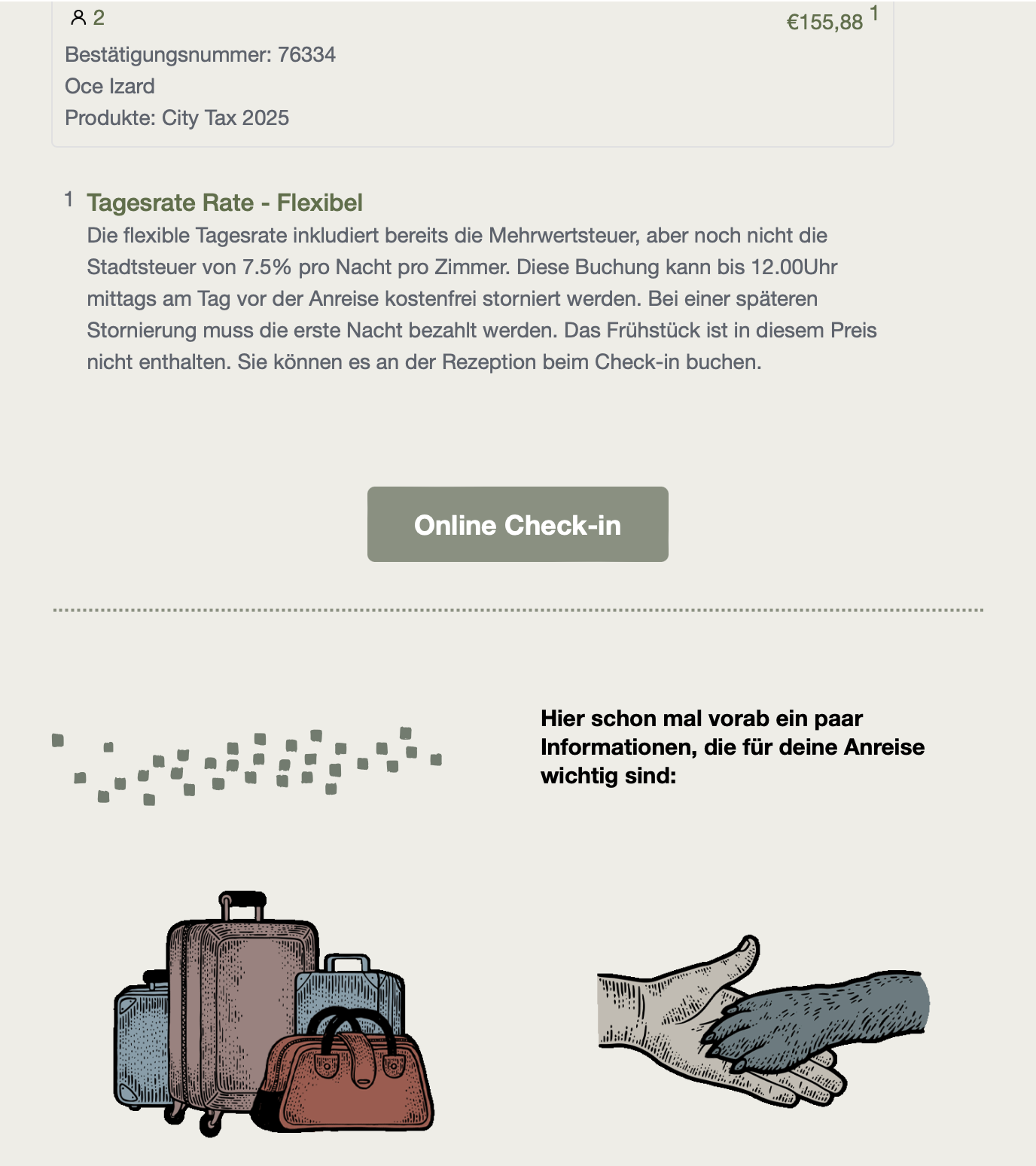
Hello Community,

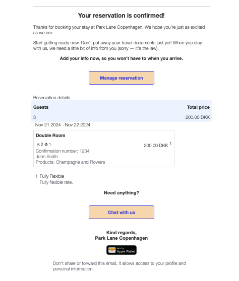
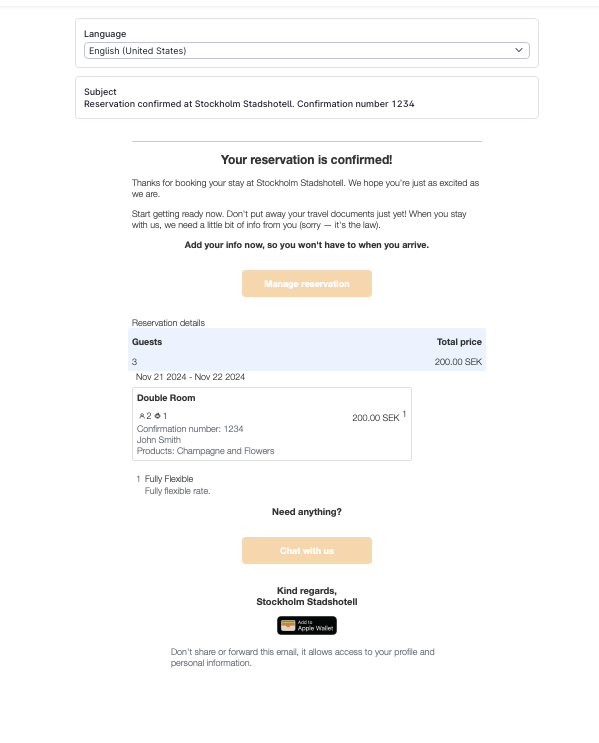
I am reaching out regarding two issues with my booking confirmation email for a hotel, created through Beefree and integrated into Mews.

  1. Button Display:

    • When I insert a button with the {signInLink} placeholder, the button appears in blue by default on Mews, despite the background colour I set in Beefree.
    • I would like to know how to force the button’s colour in the HTML code so that it displays correctly.
  2. Header Logo:

    • A default logo appears in the header on all emails in Mews. I am unable to remove it to personalise or replace it.

Thank you in advance for your assistance with these points.

Best regards,

Océane


Hi @Oceberlin 
Had a closer look at this for you.
When using the SignInLink option, it will generate a blue button. To customise the button, such as colour, use the SignInUrl placeholder.
Same would apply for the following:
ManageReservationLink > ManageReservationURL instead
ChatLink ? ChatURL instead

With regard to the logo, it’s not possible to remove the top Mews logo, but you can edit the second logo, which it looks like you have done. 
There is further guidance here

I hope that helps. Let me know if you still have issues editing.

Thanks
Sarah


Hi Sarah

you wrote

“to customise the button, such as colour, use the SignInUrl placeholder.” But how to change the colour settings for the place holder ?

Could you provide an example of how to do ?


Hello!

Try putting the following css tag in your <style></style> clause within your email template:


       table.raisedButton {
          background-color: #3BD962 !important;
       }


The above will make the Button green. You can put other styling for that button in there too...

For the Chat Button use “table.ghostButton” as your css selector…

You can find out what css selector to use by using the Inspect Tool in your browser.

I am not sure all email clients will render it correctly, but that’s just as much as you can do at the moment.

Kind regards,

JP.


Thanks JP it worked…..

Just for clarity the text you need is:-

Green version 😉

<p>{signInLink}<style>table.raisedButton {background-color: #3BD962 !important;}</style></p>

Yellow version 😂 

<p>{signInLink}<style>table.raisedButton {background-color: #FF33E3 !important;}</style></p> 

Pink version 😂 

<p>{signInLink}<style>table.raisedButton {background-color: #FFBF00 !important;}</style></p> 


HTML colour codes can be found on - https://htmlcolorcodes.com


And for the Logo at the top:

You cannot remove it, it’s the logo you upload in your property settings…

It’s just so small, that it looks weird IMHO… I increased the size a little bit so that on can actually see the Logo details. That can be done by adding the following CSS (within a <style></style> tag of course):


        img.flexibleLogo {
height: 125px !important;
max-height: 125px !important;
}

@Sarah.Masterton-Brown Let me add on more thing to the discussion (template styling is problematic at least, see all the other discussions about it): If we change the template from the default, only the languages with customized templates are used, right? So if we have, let’s say German and American English templates, than only German (if applicable) or English (in all other cases) is used to construct emails, right). However, for the transactional emails in relation to the payment, it’s quite nice to have the default translations in all the different languages. So, by customizing these transactional email templates the default translations are lost (except when the customization is applied in all the different languages - but thats a tedious task)… So it would be great to have a customization method to only change style (css wise) in general, without affecting the actual content.

In summary, if you ever redesign the templating system, try to make it possible to separate content from styling. At best it would be great to have a thre tiered cascading templating system:

  • General CSS Styling (a separate field valid for all email templates to quickly and consistently change styling)
    • Generall company information content (like Logo, legal footer), to facilitate fast and consistently key corporate ID and legal requirement parts - one field for all templates
      • actual content - this is of course individual to each template - it resembles the content that we currently have minus the header and footer parts

I put these remarks also in the feedback at https://feedback.mews.com/forums/955598-guest-experience/suggestions/46549330-customizeable-email-templates

Anyone likes to upvote that? :-)

Regards,

JP.


it worked - thanks for the tip.

<p>{signInLink}<style>table.raisedButton {background-color: #DABC8B !important;}</style></p>


​@j.spiess

- I am no expert here - but I have managed to figure out how to change the background colour for the GhostButtons… but how do you change the font color & the frame color ?


Those who want to change the color of the buttons, please see below:-

This is for the “Confirmation template”

<h2 style='text-align:center'>Your reservation is confirmed!</h2><p>Thanks for booking your stay at {enterpriseName}. We hope you're just as excited as we are.</p><p>Start getting ready now. Don't put away your travel documents just yet! When you stay with us, we need a little bit of info from you (sorry — it's the law).</p><p style='text-align:center;font-weight:bold'>Add your info now, so you won't have to when you arrive.

<p>{manageReservationLink}<style>table.ghostButton {background-color: #F6D6AD !important;}</style></p>


Reservation details</h3><div style='border-radius:4px;background:#ecf3fe;margin:0 -8px;padding:8px 8px 0 8px'>{summaryHtml}</div>{reservationDetailsHtml}<h3 style='text-align:center'>


Need anything?

<p>{chatLink}</p>

<style>

  table.ghostButton {

    border-color: #F6D6AD !important;

  }

td.ghostButtonContent a {

      color: rgb(255, 255, 255) !important; /* White text for the link */

      text-decoration: none; /* Remove underline from the link */

    }

</style>


Kind regards,<br/>{enterpriseName}</p><p style='text-align:center'>{addToAppleWalletLink}</p>


Hi!

You can use this combination to update all buttons to look the same:
<style>a {color: #FFFFFF !important;}.raisedButton.button {background-color: #000080 !important;}.ghostButton.button {background-color: #000080 !important;border-color: #FFFFFF !important;}</style>

Please be aware you do depend on the browser the recipient uses how the buttons are displayed as the CSS is not always supported. It might be different from what you see in Mews.

To ensure the correct display, I recommend to use the place holders and create your own button using HTML or CSS. Or upload an image of a button and link the URL.

Example:
Use {signInURL} instead of {signInLink}.

In the style, create you button:

  .custom-button {
    background-color: rgb(0, 60, 127);
    color: white;
    padding: 8px 16px; /* Adjust padding to match the page buttons */
    border: none;
    border-radius: 5px;
    cursor: pointer;
    font-size: 16px;
    font-weight: bold;
    width: 250px; /* Set the width as per the button on the page */
    height: 50px; /* Set the height as per the button on the page */
  }

In the body, call the button class and attach the placeholder:
<div style="text-align: center;">
  <a href="https://www.example.com" class="custom-button">
    Click Me
  </a>
</div>

Of course the button must be placed in the center and align with your requirements in size, font and color.


Regards,


Bram


Hello ​@N.HALL Consulting 

Try


<style>
table.raisedButton {
background-color: #3BD962 !important;
border-color: #3BD962 !important;
}
td.raisedButtonContent > a {
color: #3d3d3d !important;
}
</style>

somewhere in the head of your template … replace with the colors you like...

It just boils down to finding the right css selector :-)… Analyse the template preview with your browser development tools (right click → Inspect), findout how you can uniquely or generally target the entity you wish to change, then you can also change the properties on the fly to figure out how you would like it to look. Finally pack your css in a style tag at the top of your template…

Happy tag hunting … :-)

Kind regards,,

JP.


Reply