Would it be silly to have 2 buttons on the Billing Screen?

We find our front desk staff often close bills by accident as the “Charge and Close” button is so prominent.
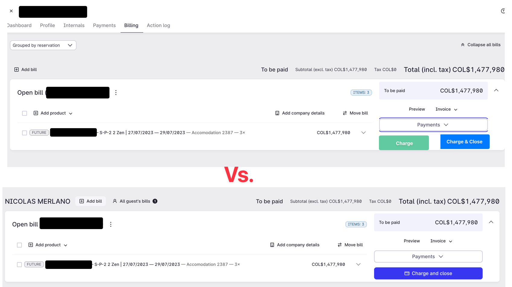
 

Hi @Ethros ,

I cannot agree more with you!!

It’s a very common mistake to accidentaly press Charge and Close instead of only charge.

The workarount via Payments > card payment > Mews Payments… works, but is not foolproof.


yes - that creates extra steps - which is what MEWS is trying to avoid!


We also have the need to ignore the big blue button, it is very rare we want this button pushed. But for our properties we prefer to charge via PDQ to avoid the higher ecommerce fees and card present transactions are better to avoid chargebacks - my vote would be the payment button highlighted not the charge buttons :)


Hello @Ethros,


this is Stepan from Mews. 🙂 Thank you for the great idea! For any suggestions I would like to recommend checking also the https://feedback.mews.com/ where you can create feature requests or upvote / comment on the existing ones. This page is checked by our product managers on regular basis to prioritize different features on Mews Roadmap. I have found similar request: Billing screen shows just 'charge'. It is always very helpful to comment on these requests to explain any further details like you do here in the community. 🙂 To make sure that your idea will get to the right person I am going to share your post and the feature request with the Product manager responsible for this domain. 


Warm regards, Stepan


I added my upvote to the other - this is CRITICAL !!  :)


I agree, I could not even remember if I personally ever used this button. I remember MEWS advertised this as a one-click action - appreciate the effort, in my opinion, its not operational. I agree with everybody above, it is leading to charging incorrect cards.

Just talking about bills, did anybody ever figure out the purpose of the “Review and close” screen before really closing it? For me, this is always an additional click which I never understood why it's needed.


Exactly.

However, for us the Review & Close feature is important to add PO-numbers or an extra reference on the invoice before closing it.


Hi there, everyone!

This is Joanna, Product Manager from Mews 😊 Thanks a lot for your feedback!

We're about to release an update to the discussed functionality:  When you click on the "Charge & Close" button, you'll see all the attached credit cards, and you can choose the right one to charge. We're also adding an extra step to confirm the selected card so that mistakes are avoided.


Your feedback is vital to us! Let us know if this solves the issues you raised.

Stay tuned for more enhancements to the billing screen. If you'd like to be involved in our research/user testing, drop a comment! Thanks again! 😊🙌

Joanna


Hi @Joanna Kozlowska,

Really great!

Just one more question though. Is it possbile to display the last 4 digits of the AMEX cards?
Currently only 3 are shown, which is sometimes confusing. Furthermore, OTA’s always need 4 digits when reporting an invalid credit card on their extranet…

Thanks for giving this a thought.

Matthias


Hey @MatthiasH, glad you like it! :) 

Can you tell me where only 3 digits of Amex are currently shown?

Best,

Joanna


Hey @MatthiasH, glad you like it! :) 

Can you tell me where only 3 digits of Amex are currently shown?

Best,

Joanna


Hi @Joanna Kozlowska ,

This is a recurrent issue throughout the system (payments tab, reservation overview, billingscreen...).


@Joanna Kozlowska  was this feature already released?
In our properties we now see the card number but the charge & close button is not working properly and super slow, we opened a support ticket. 

Thanks for any updates, 

Sam


Hey @MatthiasH, glad you like it! :) 

Can you tell me where only 3 digits of Amex are currently shown?

Best,

Joanna


Hi @Joanna Kozlowska ,

This is a recurrent issue throughout the system (payments tab, reservation overview, billingscreen...).

Hi @MatthiasH, could you send me privately some screenshots? I understood we always show the last four digits of a credit card number, regardless of the issuer.  I am happy to check it further with the relevant team.


Hi @Joanna Kozlowska ,

I’ll send you some screenshot in a message.

Maybe also mentioning that there is also an feedback request from 2022 about this.

https://feedback.mews.com/forums/918742-mews-payments/suggestions/44901451-afficher-les-4-derniers-chiffres-d-une-amex


@Sam Dorothy from Mews Support, thank you for bringing this to our attention. This is to let you know that we submitted a ticket to the developers so they can investigate this unusual behavior further. Thank you for the video as well. As soon as we have an update from them, we will let you know. If anything else, please keep us posted. 


Hi there, everyone!

This is Joanna, Product Manager from Mews 😊 Thanks a lot for your feedback!

We're about to release an update to the discussed functionality:  When you click on the "Charge & Close" button, you'll see all the attached credit cards, and you can choose the right one to charge. We're also adding an extra step to confirm the selected card so that mistakes are avoided.


Your feedback is vital to us! Let us know if this solves the issues you raised.

Stay tuned for more enhancements to the billing screen. If you'd like to be involved in our research/user testing, drop a comment! Thanks again! 😊🙌

Joanna

Hi @Joanna Kozlowska

This is great, however we are seeing what appears to be a bug. I've shared with support already, but in this screenshare, the payment fails but the progress circle keeps spinning but does not close, it appears to be frozen & we have to click on the screen / refresh for the page to respond. 


Hi there, everyone!

This is Joanna, Product Manager from Mews 😊 Thanks a lot for your feedback!

We're about to release an update to the discussed functionality:  When you click on the "Charge & Close" button, you'll see all the attached credit cards, and you can choose the right one to charge. We're also adding an extra step to confirm the selected card so that mistakes are avoided.


Your feedback is vital to us! Let us know if this solves the issues you raised.

Stay tuned for more enhancements to the billing screen. If you'd like to be involved in our research/user testing, drop a comment! Thanks again! 😊🙌

Joanna

Hi @Joanna Kozlowska

This is great, however we are seeing what appears to be a bug. I've shared with support already, but in this screenshare, the payment fails but the progress circle keeps spinning but does not close, it appears to be frozen & we have to click on the screen / refresh for the page to respond. 


Hi Mick,

This now has been fixed!

Thanks for letting us know,

Joanna


Reply