Dear Tristan,
I am a reservation agent, and I have a few comments about the new screen.
In many ways, I think it is very nice and practical. I believe that once people get used to it, all the changes will start to make sense.
However, there are a few things I miss from the old system that made my workflow smoother. These features are now missing, and I really feel their absence.
1. Booker and guest names being visible
Booker: The booker is an important part of a reservation. In many cases, they are the person we contact when discussing reservation details, resolving problems, or transferring bills. Being able to copy and paste a name directly between Mews and emails was a very welcome feature.
Also, for colleagues who do not work with bookers regularly but need to contact them from time to time, finding their names has now become more difficult.
Guest names: Previously, for check-in purposes, the receptionist had to click on a guest’s name, complete their profile, return to the reservation, and then click on the next guest’s name to complete their profile. Now, an additional step has been introduced. I am not sure how this can be considered an improvement.
Similar to the booker information, the easy copy-and-paste functionality has also disappeared.
We have rooms that can accommodate up to seven people, as well as group reservations with long guest lists. Previously, it was very easy to double-check guest names directly in the reservation. Now, this requires an extra step and creates more room for mistakes.
2. Guest internals not being visible next to the guest’s name
Guest internals are a very useful feature that we use frequently in our daily operations.
For example, if a guest has caused problems in the past, we can use internals to document the issue so that everyone is aware of it. We also use them to record information about returning guests, such as their favourite things, preferred rooms, car models, and other recurring preferences.
This feature helps us provide the best possible service without having to remember every detail or rely on another programme.
The internals are still there, but once again, they are now hidden behind at least two clicks. The guest’s name does not even indicate that any internals are attached to it.
I really appreciated being able to hover over a guest’s name with my mouse and see their internals displayed in the frame above it. It was quick, simple, and very practical.
3. Sending emails to guests directly from the system
This is a relatively minor point, but I miss being able to send emails by simply pressing Enter on my keyboard. It was much quicker: just click, click, and all the emails I needed were sent.
4. Notes in group reservations
It was really convenient to select multiple reservations and add or edit notes for all of them at once.
Now, I can only add notes to an entire group, and whenever I need to change something, I have to go through the reservations one by one.
I am also no longer able to see the notes easily because, when I select multiple rooms, the reservation overview disappears.
Simply put, the old reservation screen felt like an open book. Everything I needed was visible and easily accessible.
Now, it feels as though I have to open several different pages just to find information and perform tasks that I still need to carry out efficiently.
I understand that changes and improvements and I can see the potential of the new screen. It reminds me of social media; once you get used to it, it will be very organic. Important things on top, less important hidden behind more clicks. However, I believe that some of the features mentioned above were genuinely valuable for our daily operations, not only technically, but also for what we want to bring as a hotel to our guests. I would love to see them brought back or made more easily accessible.
Thank you for taking the time to consider my feedback.
Best regards,
Dagmara Malindrová
Reservation Agent
MOSAIC HOUSE s.r.o.
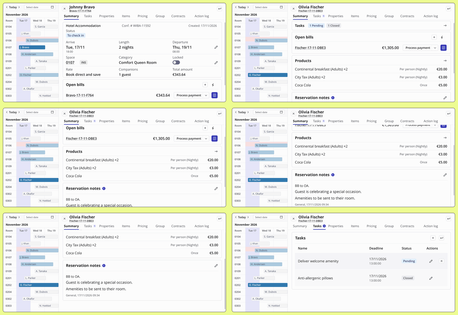
 The video walks through two arrivals and shows how to check room status, confirm what’s included, review tasks and open Billing. Watch the walkthrough video